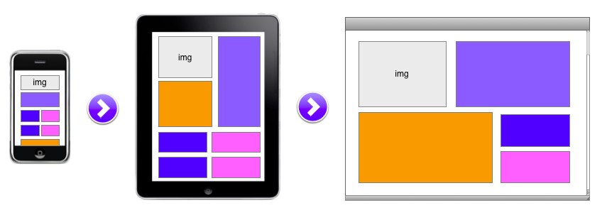
While responsive web design has been around for a while, it really seems like the past 6 months or so it’s bounced back into the spotlight. I have seen a lot of articles talking about the pros and cons of using such approaches. Some of these articles are quite prescriptive on the approach. For those who are less familiar with it, let me give a quick summary.
Responsive web design is a technique that can leverage standard markup, CSS, and Javascript. There is no magic or trickery..other than the actual know-how to get such a site designed and built properly. By no means do I know a ton about Responsive Web Design, I am merely using this as a tool to help make my point.
Many groups recommend you actually start with the mobile view first. The mobile first movement suggests you look at the key things your user will want to do in mobile (assuming the most simplified view) and then build up to the tablet or desktop view from there.
Progressive Web Design is another tactic that is leveraged in these common approaches outlined above. The idea here is to use basic markup; then based on browser capabilities you can “enhance” the experience. In simple terms start with a basic level 1 experience, then you test to see if your browser is advanced enough to get experience level 2 (or 3, or whatever you want to name it) and then if so, the code gets executed.
This seems like a great approach to solve my problem of building multiple websites! Right? Well, all good things come with a catch. If you think about a news style site, like SmashingMagazine.com, it doesn’t matter if the user is on their desktop reading articles or on the bus viewing the site on their phone. They are doing the same tasks, just optimized for a screen type. If you have different scenarios for your mobile users that are unique, does this mean it’s broken?
This is where my frustration comes in on the articles I’ve seen. Too many people are taking the view on one of two dimensions. FIRST: Responsive is the end all be all approach and really solves world hunger. (ok, maybe a touch over blown). Yes, it does great things that appear magical, it helps me build to a single code base and it helps my SEO story with a single URL approach. SECOND: Responsive doesn’t help me because I need to optimize my business for mobile differently than I do on the desktop site.
By all means.. both views are important, and both have merit. What you need to realize is this: Getting religious on how people should build sites is a bit like.. well, getting religious about your religion vs. someone else’s religion. Neither one of you may be wrong.. but you have your beliefs.
I’d say take what you need from each approach. (back to the tech talk here, not religion). There is no reason you can’t leverage the great flow layouts from a responsive web design and still have very mobile specific approaches to solve for specific scenarios that are different across device types. These can be handled on the server side with some intelligent code at run-time.
Leverage Progressive for building up capabilities on the fly. Be smart, be adaptive. Leverage business intelligence at the server layer to make content choices, optimize images, custom deliver CSS and optimize where you can. Finally.. go with Responsive for a single code base for rendering across devices. PAR… this approach of Progressive, Adaptive and Responsive is a way to be smart while still leveraging what others have done without handcuffing you to a single approach.
The purist view of responsive means you do everything client side to determine what shows on devices and how it renders. We just know that we have certain things we want to be smart about given ample opportunity. This is why with an adaptive approach you can:
- Not send a single image and scale it via % widths from desktop to mobile. Do try to optimize and load the right JPG based on device width
- Use EM for fonts.
- Using @media-query options is great at run time.. but could you save code on the download and optimize on the server side based on device width? (rather than user-agent)
- Be smart about content, not all content has to be sent back. Send content ABC where it makes sense and mix/replace XYZ with proper events when triggered.
So.. this is just a suggestion, but don’t get overly critical about how people are approaching their site design and implementation. Personally I have always found the thing that works best is to leverage the best of all approaches and make it work for me. PAR just happens to be a good blend of capabilities as I see it.
